Earlier this week I published my first zine, “Land Of God”. Now I want to give an overview of the steps I took, and hopefully help others who are thinking of doing the same.
Step 1: Take some photos
Hopefully no explanation required.
Step 2: Process and edit your photos

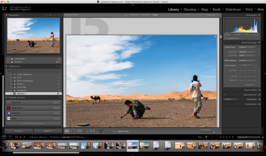
There’s so much that can be written about this step – and so much that I hope to write about eventually – since choosing the photos you intend to present will be the meat of any photography project. For the purposes of this guide, I’ll have to handwave most of this step, but the output of this step should be the set of photos you intend to include in your zine.
I use Adobe Lightroom Classic CC to process and edit photos.
Step 3: Research some printing services
This step might feel like we’re jumping the gun here. Don’t worry, in a later step we’ll actually send our digital copy off to the printer to get printed. However, I strongly encourage you to research what printing services you want to use before you start creating the layout of your zine.
The reason is because you need to figure out your budget for this project, and your various printing options, such as the dimensions of your zine, the number of pages, the weight of the paper, whether or not you’re going to have color, etc. determine the price of your print job.
In your research, you’ll likely find that printing services broadly fall into two categories: (1) large online self-serve services, where you pick all the options yourself, upload your digital copy, enter your billing and shipping info, and then they print it and ship it to you; and (2) local print shops, which offer more hands-on service but will likely be more expensive.
I went with option (1) and printed my zine through MGX Copy, which was one of the cheapest online options available. I don’t get any referrals or kick-backs from them.
The goal of this step is to give you an idea of the final price tag, depending on what layout decisions you make.
Step 4: Create the layout for your zine
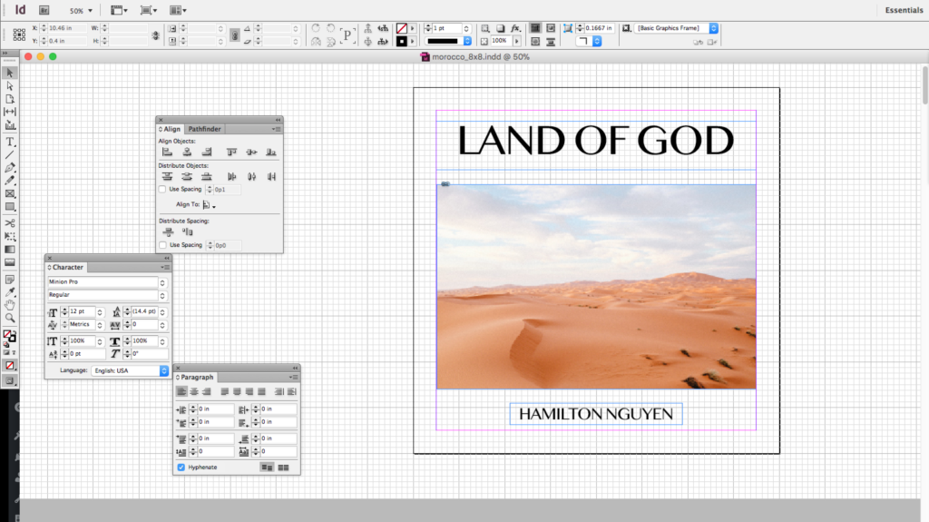
This is where you’ll probably want to use some type of desktop publishing software. I used Adobe InDesign (which has a free trial). Microsoft Publisher and Scribus (which is open-source and free) are two other big names.
Ultimately the output of this step should be a file that you can convert to a PDF to send to your printer, so if you’re feeling extra DIY you could theoretically use any software that can export to PDF. Publishing software is just the most apt tool for this job.
There’s a few important things to think about here:
Dimensions of your book
I went with a square format, 8″x8″ for “Land Of God”. Whether your photos are primarily landscape, portrait, or a mix may influence your choices here. Originally I was playing with a portrait dimension (namely 5.5″x8.5″) which felt more natural as a book form-factor than a landscape dimension, but which I felt didn’t work as well for my photos since they were primarily landscape. I ended up choosing a square format to get the best of both worlds.
Ordering of photos
Some people consider the act of choosing the ordering of photos to be part of editing. I’m including it here because once you start actually putting photos into your publishing software, it’s much easier to get a good feel for how that ordering will be consumed by your audience. The goal is to use the ordering to help tell your story or convey your theme(s). Mine was fairly straightforward – the goal of my zine was to mostly capture my feelings about my trip to Morocco, and the photos are roughly arranged in chronological order. But even if your photos aren’t all from a specific event, you can still play with the order to present a particular narrative.
Pairing photos
To me, how you pair your photos is the most important (and most fun) part of designing a zine or photobook layout. The reason we’re talking about photos is because books typically have two pages open at a time, and it’s pretty natural to have one photo per page. Therefore, your viewer will be looking at two photos at the same time. The choices you make with your pairings will have the most obvious and deliberate effect on your viewer, far more than any other choices you’ll make with the layout elsewhere.
There’s so much you can convey with your pairing choices. This is your opportunity to get really creative. For example, you can draw parallels between two seemingly unrelated photos that happen to have similar composition. Or you can juxtapose two photos that have opposite settings or subjects. Or you can choose two photos that tell two parts of a story. Or two photos that use color in the same way. The list of potential ideas goes on and on.
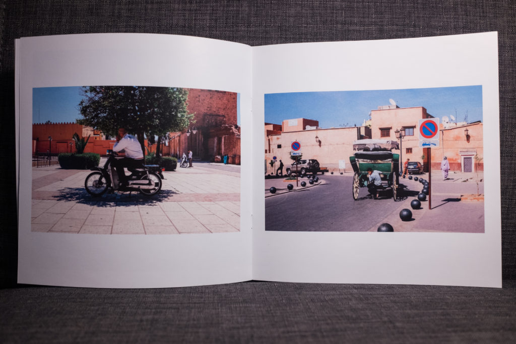
Pulling an example from “Land Of God”, here is one of my favorite pairings.
The composition and color are parallel – both feature a person, crouching, “hiding” behind a green object, centered in the middle of the frame. Both evoke feelings of secrecy and privacy. There’s a subtle difference in that one has the subject looking away from the camera, while the other has the subject looking directly at it.
Positioning photos across spreads
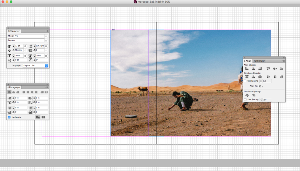
For some photos, you may choose to take a single photo and position it across a two-page spread (i.e. two pages that are facing each other). You should think about how to best position that photo. Here’s an example:
You can see that I positioned the photo so that the gutter (i.e. the crease of the zine) falls along a part of the photo where it won’t cut off any important elements.
Dealing with bleeds
Bleed refers to having a printed image that runs all the way to the physical edge of the paper. The opposite of having a bleed is to have a white margin between the edge of the photo and the physical edge of the paper.
You may choose to have your photos go full bleed, or bleed only on one edge, or no bleed at all. No bleed is the default for most printing services – if you choose to have some bleed, you should work with your printer to figure out how to make your lay out accurately handle bleed. Typically, what this involves is setting the dimensions of your digital file to be slightly larger than your desired final printed dimensions (for example, I would have set my file to have the size 8.25″x8.25″ if I wanted to use bleed). MGXCopy, the printing service I used, has this guide for designing for bleeds.
Number of photos and number of pages
You can only have zines printed with a page count that is a multiple of four. It’s worth calling this out if this is your first time dealing with print publishing. The requirement comes from how the booklets are made. Imagine taking a piece of paper and folding it in half, resulting in four separate “sides” that you can print on – there’s where the four pages are coming from.
Obviously you don’t have to put photos on all of these pages and you can leave as many of them blank as you want. In fact, you can’t put photos on all of these pages because…
You need to count your cover page and title page too. In fact, I’ll call out the cover page, the opposite side of your cover page, your title page, the opposite side of your back cover, and your back cover – these are all pages that you’ll have to account for.
Step 5: Export your digital copy to a PDF and send it to your printer
You should work with your printer to figure out what they’re expecting, but in general you should be exporting at the highest possible image quality (no reason to hold back now). I just used InDesign’s “Adobe PDF (Print)” format, but your publishing software may require you to input some additional parameters.
Step 6: Review the proof from your printer
After submitting your digital copy, your printer should give you a proof. The proof is how you make sure you and your printer are on the same page on what is about to be printed.
At a minimum, your printer should give you a digital proof. If you’re using an online service, this is commonly how they’ll handle proofs. A digital proof is the PDF that they will print from, so you can still use it to check for errors. Check to make sure image quality looks good, colors look good (they should have instructions on how to calibrate colors), margins look good, etc. One thing I wanted to check in particular for my zine was fonts – since I used a bit of Arabic-language text in my foreword, I double-checked to make sure that font was sent through.
Your printer might also be able to provide you with a physical proof, although sometimes at extra cost. This is even closer to the final product.
A good printer will give you a list of things that they specifically want your sign-off on before proceeding. For example, with my proof they pointed out that they had to change the color mode, and wanted me to verify I was OK with the difference in color (which I was). It was reassuring to know that they were on the lookout for potential issues like that.
Step 7: Receive your zine!
That’s it! After you’ve given final sign-off, your printer will print the zines and ship them to you (or make them available to pick-up). Once the copies are in your hands, it’s up to you to decide how you want to distribute!
Summary
Overall, making my own zine was an incredibly fun and rewarding experience. It was awesome to work on a personal photography project that had a very real, physical output. The editing process made me so much more reflective about this set of photos and about that trip as a whole. But moreover, it was a lot of fun to learn about the publishing process as well. I feel like I picked up additional skills in learning InDesign and learning some of the basics about print publishing.
I think what I want to stress the most was how unexpectedly easy so many of these steps are. I found InDesign fairly easy to use at a basic level and I found working with an online print service to be pretty straightforward. If you’ve been afraid of printing your own zines because of all the unknowns – don’t be! I hope you’ve found this guide illuminating. If you have any questions or want advice on your own zine, leave a comment or send me an email (hamilton09nguyen@gmail.com)! Or, if you have a zine of your own that you want to share – email me! I would LOVE to see what other people are working on.
That’s all for now!


Leave a Reply